How Top Interior Designers Plan Color Schemes in Home Interiors
The use of color can transform the way a home looks. When it comes to home design, the right color scheme can harmonize the look of every room, enhance aesthetic appeal, unify finishes, create the right ambiance, influence moods, and determine the success or failure of the decor. We all know about colors but when it’s about home improvements, it is best to consult a top interior designer who understands color and knows how to work with color to create beautiful spaces.
How interior Designers Plan a Color Scheme
Every interior designer follows a few basics on color theory to finalize the color scheme for home interiors. Here is an outline from expert interior designers:-
- Understand each rooms space and its utility,
- What is the budget for home interiors,
- Develop a 3D design blueprint or mood board with estimates on prices as per changes in products,
- Plan everything behind walls/ceilings – the electrical, HVAC, plumbing to give the room a cleaner look,
- Decide on false ceilings, crowning, etc., as it adds to the design plan,
- Select flooring according to the traffic expected in the room,
- Decide on the look of the furniture pieces, especially those that are less movable, like kitchen cabinets, bathroom cabinets, and wardrobes.
- Arrive at a color for walls to go with the flooring and furniture,
- Check natural lights and the effect of artificial lighting to provide the desired effect, and,
- Add home accessories, furnishing and finishes for a complete look.
In the early stages of design, the homeowner and interior designer initiate discussion on color scheme preference. It is from the very first step that color begins to play a role. Today top interior designers in Mumbai and other metro cities use color theory to create unique and beautiful homes. They understand the importance of color and are well-versed with the color wheel, dimensions of color (like hue, tint, value, shade, intensity, tone, neutrals), color contrasts, color moods, color temperature, and the overall effect of color on space.
What is a color scheme in interior design?
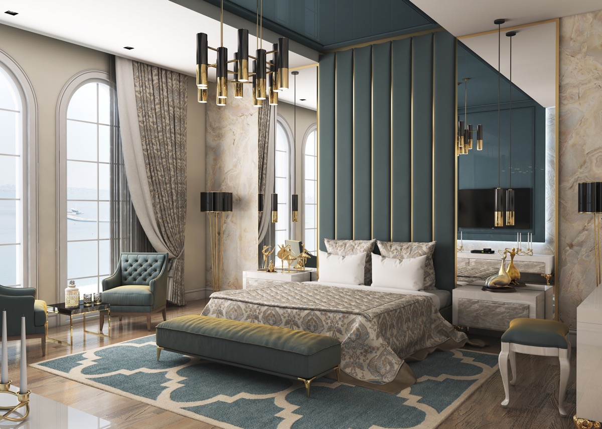
A color scheme is basically the arrangement or combination of colors to form an integrated whole. In interior design, it refers to the organization and choices of colors placed throughout a space to create a visual relationship between two or more adjacent areas or cohesion across multi-functional spaces. These colors combinations enhance a particular style and add symbolism to the home.
A color scheme consists of a primary or main color, an accent color, a secondary accent color, and a bold color. The main color forms the foundation of the color scheme and is used as a primary wall color or on large pieces of furniture. The accent color, complements or contrasts the primary color to balance the palette or adds drama to a monochromatic scheme. The secondary accent color is optional and used sparingly to add a subdued tint or shade. The bold color is the last color used to bring a ”pop of color” to create a focal point in a space.
The success of any color scheme depends on the context of the area designed.
The context will have different implications depending on – square footage in the apartment, demographics of the homeowners, their psychological mind set, and lifestyle.
The seven types of color schemes
The color schemes utilize colors at certain locations on the color wheel. An interior designer chooses a color scheme or color palette by identifying the relationship between the colors. Since about 60% of the assessment of the décor depends on color, the color scheme plays a crucial part in interior design. Here are seven major types of color schemes, viz: –
1. Monochromatic color scheme

A monochromatic color scheme uses just one color but with a variety of tones or varying levels of saturation. It has three main components – hue, shade and tint. This color scheme produces a consistent look and feel and is well-suited for small spaces like the study or bathroom.
2. Analogous color scheme

The term analogous refers to corresponding to something. In an analogous color scheme, the colors are similar and next to each other on the color wheel. An analogous color scheme can be formed by pairing three colors directly to the left or right. The colors usually match well and create a harmonious feel.
3. Complementary color scheme

As the name suggests, a complementary color scheme uses two colors directly opposite each other on the color wheel. In these contrasting colors, one color acts as the dominant color and the other as an accent. This color scheme helps to attract attention or highlight a focal point in the room. Because this scheme combines warm and cold colors, the interior designer has to take care to achieve a harmonious balance. While this scheme is good in any room, it looks best in living rooms.
4. Split complementary color scheme

A split complementary scheme is another option for the complementary palette, which includes one dominant color and the two colors adjacent to its complement. Since the split-complementary combination creates a bold palette, it can be difficult to balance. Though used in interiors, it looks equally good on the exteriors of a villa or building.
5. Triadic color scheme

A triadic color scheme comprises three colors equally placed around the color wheel. This color scheme helps to make a room feel uplifting and vibrant. It offers high contrasting color yet looks pleasing as it retains the same tone. There are four basic triad color combinations –
Orange, green, violet
Red, yellow, blue
Red-orange, yellow-green, blue-violet
Yellow-orange, blue-blue-green, red-violet
6. Square color scheme

The square color scheme in interior design combines four colors. One color is the base color, and the other three equidistant from each other and 90 degrees apart from the base color on the color wheel, form a square or diamond shape. The best way to start is by making the darkest color your dominant color to be used on the floor and the brightest to end on the ceiling or any higher part of the room.
7. Rectangle color scheme or Tetradic color scheme

The rectangle color scheme or tetradic color scheme uses four colors arranged into two sets of complementary colors opposite each other on the color wheel. Like the square color palette, count two spaces on the color wheel in either direction. It is the richest of all color schemes but also very difficult to pull-off correctly in interior design. No matter which color scheme you choose, keep in mind the final look you want to achieve!
Conclusion
Equipped with knowledge about a color scheme, start by picking a color for the largest pattern or element in the space and then try various combinations using the color wheel. Remember the 60-30-10 rule, the color context, how lighting affects colors, and you are ready to go!!


